Hi.
I’m Kerry.
I’m a Senior User Experience Researcher, living in New York City.

I’m Kerry.
I’m a Senior User Experience Researcher, living in New York City.

Image: Final design for YouInvest™
Company / Context: J.P. Morgan Chase • Digital Customer Experience (DCE) + Digital Wealth Management (DWM) teams.
Timeline: 2017 – 2019
Product: YouInvest™ — a new self-directed investing platform for first-time investors.
Goal: Enable “Starters” (savers with $25k+ in cash but <$10k invested) to gain confidence and open their first investment account.
Outcome: By March 2020, 4–5 % of weekly site visitors opened a YouInvest account — a significant conversion for a new product category.
Senior UX Researcher on a two-person Cadence Research team.
Co-led rolling cycles of usability and concept testing across web and mobile investing products.
Partnered with design leads, PMs, and analytics teams to define research priorities and translate insights into roadmap decisions.
Delivered ongoing stakeholder workshops and journey map synthesis to inform personas and launch strategy.
Many potential customers lacked basic investment knowledge and trusted traditional savings over stock market investing.
Chase needed to design a digital experience that built trust and literacy — without human advisors.
Research goal: identify what language, content, and UI patterns increase confidence and conversion for first-time investors.
Rolling Program (18 months):
Continuous 1:1 interviews and usability sessions (~25 cycles).
Mixed methods: lab studies and hallway validations.
Discovery → Evaluation → Launch (cadence ensured weekly insight delivery)
Key Methods Used:
Affinity mapping & thematic analysis.
Persona development for “Starters.”
Customer journey map creation (linking confidence milestones).
Stakeholder workshops to co-prioritize UX improvements.
We recruited people who had more than $25K in a savings account and less than $10K invested in the stock market, preferably in a mutual fund. We called this population “Starters.”
These criteria aligned with Chase’s target audience for YouInvest — consumers with capital but low market confidence.
Sample size: Our studies were always bi-weekly, with ten individuals, over the course of two days. We worked closely with a recruitment agency to target the right people.
Do people understand how “robo” accounts work?
Would people expect to meet with a human advisor?
How do people respond when they learn their money would be managed by a “robo-advisor”?
How do people react to the concept of letting an algorithm manage their investments?
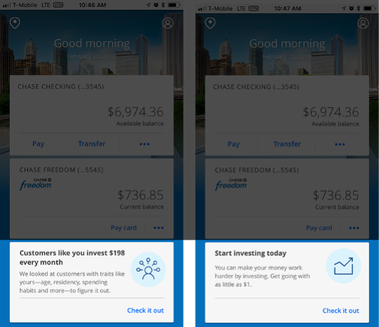
Image: CTA, content iterations

Image: Content iterations, with Drive metaphor (ultimately scrapped)

Image: Content iterations with drive metaphor (ultimately scrapped)

4–5 % conversion rate of site visitors opening YouInvest accounts post-launch.
Customer-journey map for “Starter” investors became a reference framework across DWM.
Rolling-research model scaled to additional Chase investment products.
Team recognized internally for contributing to the smoothest digital-product launch in DWM history.

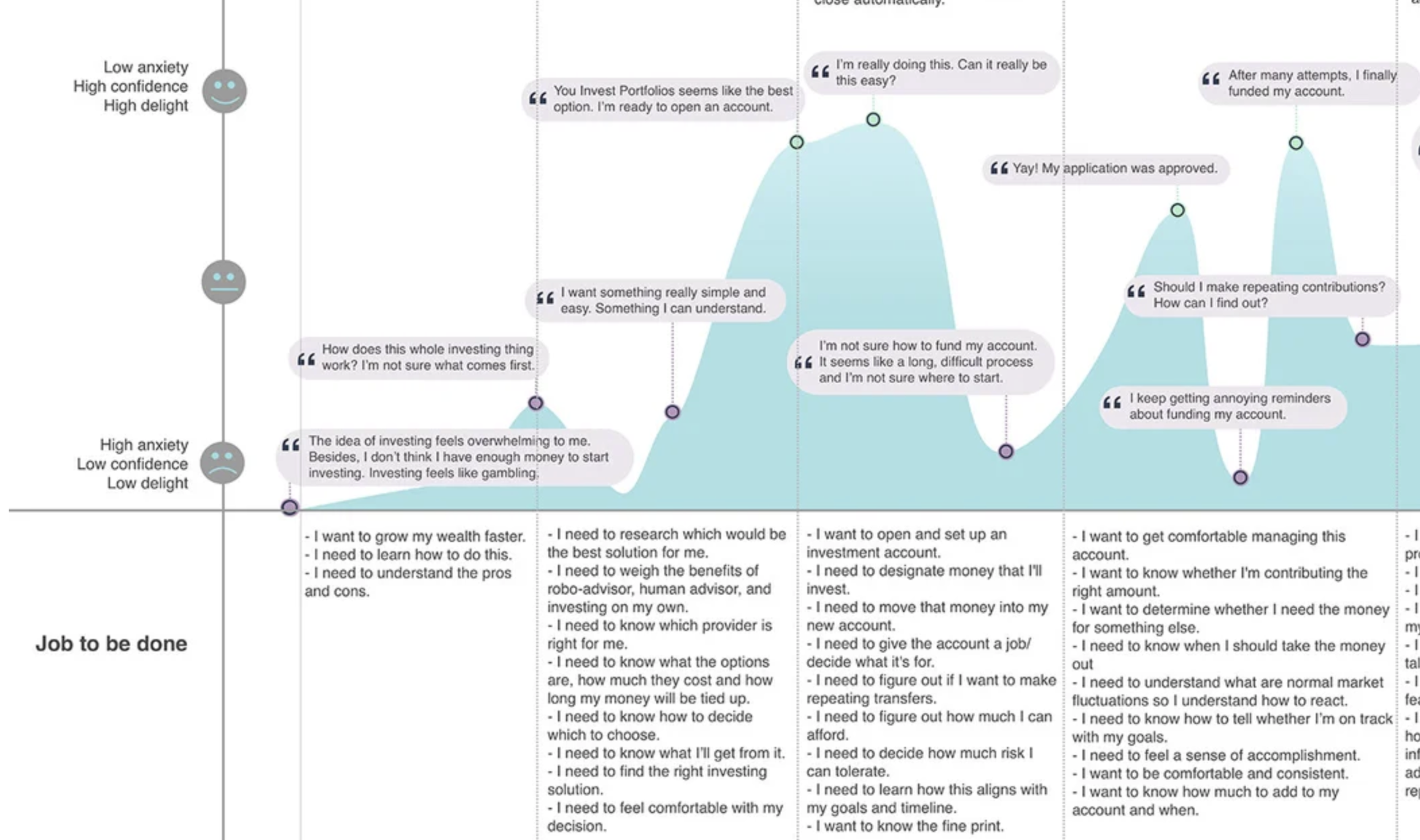
Image: Journey map detail